Showing posts with label photoshop. Show all posts

2.09.2011

..:: DIG THIS ::..

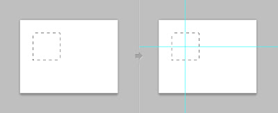
Do you use PhotoShop?
Do You often say to yourself, "I wish I could automatically make guides?"

Well, ask no more!

Cameron Mcefee has created this sweet little plug in that makes it as easy as clicking!

Go download it HERE.

Via Staple Design


4.14.2010

..:: iLike ::..


If you follow me on twitter, then you know that I am excited for the launch of the new CS5. (Which launched on April 12th)

Here is a look at the new icons. (Click the image to get a better look.) I know this is super nerdy, but, I love this kind of stuff.

Via logodesignerblog.com

After some speculation we now can see the official logos of Adobe CS5, now with 3D and an extra colour added in.

I think it’s a nice gradual change and I think the extra colour will make it easier to distinguish each product rather than the full black letters of the old logos, though I would be interested to know the design decisions behind the 3D aspect on some of the logos – maybe to make them pop more on our desktops?

What do you think?

2.04.2010

..:: THOUGHTS? ::..


Via Logo Design Love

Simon Manchipp, one of three creative directors and partners at London-based studio SomeOne, said on Twitter yesterday:

“Logos are dead. Yet we have been featured in the new book Logo Design Love as an example of how to do Logos.

“They are a hangover from old-school thinking about branding. There is no desire by the public for a new logo. They are simply an old-fashioned approach to differentiating products or services.”

Upon questioning, Manchipp explicitly meant, “…that symbols invented to accompany brand names are a waste of time, money and effort.”

I asked David Law, Manchipp’s partner at SomeOne (and the man who kindly submitted SomeOne’s designs for inclusion in my book), what he thought of his colleague’s statement:

“It’s something we have been debating internally for quite a while.

“When you look at brands like O2, its success lies in the richness and depth of its brand world (bubbles, blue grad etc.). This forms a flexible branded platform that is instantly recognisable — you could remove the logo and still know the brand. The logo in itself is not the ‘hero’.

“In the past, brands like IBM and FedEx traded on the logo as the ‘hero’. We see it even today.

“So while we all acknowledge that the logo is not about to disappear — and that it is still an important part of any brand toolkit — there is a case for applying more emphasis on brand worlds.

“The ‘favicon’ or ‘twibbon’ is now the equivalent of the ‘black and white fax’ that we all learnt (years ago) was the minimum requirement for a logo to be recognisable as. These are much smaller applications than we have ever had to deal with, and ones where traditional logos are struggling.

“Brands now ‘move’ as standard — being ‘Apple‘ implies all sorts of physics that lend attributes to the brand and do not rely on the logo to do everything.

“Lastly, the amount of platforms, media, applications (and now ‘experiences’) that need to be branded has multiplied significantly with technology. People simply get bored quicker and brand worlds allow the conversation to ‘flow’.

“Yes, the logo is the ultimate ‘rechargeable battery’ of the brand and is the final distillation of all the brand’s attributes BUT what we are debating (and we haven’t reached any conclusion) is that if the brand world is powerful enough, could the ‘logo’ simply be the company name designed in a simple, ownable way? Possibly, dare I say it, with no symbol to sit alongside it?”

Symbol or no symbol is a valid question, and one I talk about in my book:

“Sometimes your client just needs a professional logotype to identity its business. Use of a symbol can be an unnecessary addition.

“This is something you want to determine at the outset of the project. Ask your client if she has a preference one way or another. If the company is entertaining ideas about future expansion into other markets, it might be better to opt for a distinctive logotype, because an identifying mark or symbol might prove restrictive.”

Quoted from chapter 11 of Logo Design Love.

So while Manchipp’s initial “Logos are dead” quote might be over the top, it does raise an interesting debate.

9.28.2009

..:: DIG THIS ::..


The DieLine

Here is a great site for all things package design.

About Dieline: "Established in 2007 by Andrew Gibbs, The Dieline is dedicated to the progress of the package design industry and its practitioners, students and enthusiasts. Its purpose is to define and promote the world’s best examples of packaging, and provide a place where the package design community can review, critique and stay informed of the latest industry trends and design projects being created in the field. The Dieline has quickly grown into the most visited website on package design in the world, and has become the voice of the industry. It is an active sponsor of the Pentawards, the first and only professional design competition devoted exclusively to the art of brand packaging, further promoting the field.

The Dieline, and everything we do, is for the benefit of our readers. Without their continued support and commitment, these ventures would be impossible."


Check it out

And Follow them here.

9.18.2009

..:: THOUGHTS ::..


The Sunday times reports

This could be huge!

I cant believe that the Love Irish Food people are actually claiming that they don't think they look like the same logo!

This could be a huge financial blunder on the parts of the responsible party.

Should be interesting to see how this develops.

Read more here.

7.06.2009

..:: DIG THIS ::..


I found this while surfing around the other day. And maybe I am behind in telling people about this. But, whatever. Its genius.

Layer Tennis

Its explained on the website like this:

We’re hosting a series of live design events called Layer Tennis. The season wouldn’t have happened without the support of Adobe® Creative Suite® 4, the weapon of choice for Layer Tennis players and creative professionals everywhere.

We'll be playing matches using video, animation, sound, photos, type and lots more, but the basic idea is the same no matter what tools are in use. Two competitors will swap a file back and forth in real-time, adding to and embellishing the work. Each artist gets fifteen minutes to complete a “volley” and then we post it to the site live. A third participant, a writer, provides play-by-play commentary on the action, as it happens. A match lasts for ten volleys and when it's complete, Season Ticket Holders tell us what they think and we'll declare a winner


Go check it out.

3.18.2009

..:: DIG THIS ::..


If you haven't watched the new TNT show TRUST ME, your missing out!
They bill it as "Mad Men for the rest of us." I was kinda skeptical at first, I mean I watch kind of a lot of TV, and I don't really need anymore new shows! But this one stood out and I am really getting into it. It stars Tom Cavanagh and Eric McCormack, as two friends that work at a Ad agency in Chicago, it not only does a really great job of getting the feeling of Ad work, but it brings some much needed laughs provided by Cavanagh, as Conner.
Another thing this show does very well, is brand placement. Something that is now the standard in movies and TV. But as a show about an Ad agency you cant do it without clients, smart move to not make up fake clients, they use real ones, and it does not go unnoticed. They have done a great job using them as background and not "whoring it out" like some brand placement strategies often tend to do.
Check it out.

3.16.2009

..:: PS I LOVE YOU ::..


So am I just a geek, or is this funny?! PhotoShop tie! Classic.
Not sure if its as cool as this, but its good!
I dont think I would ever wear it, but I love the concept.