Showing posts with label graphic design. Show all posts

3.30.2011

..:: iLIKE ::..


Via Nerdski

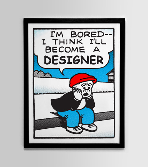
This print by New York based graphic designer and illustrator Nick Agin made me laugh because I’m sure this happens everyday. You can pick up this 3 color screen print over on his shop.

1.11.2011

..:: iWant ::..


The resolve project!

LOVE.

See more HERE.

8.11.2010

..:: DIG THIS ::..


Frank Chimero
is a guy who's work I have been following for quite awhile now, and he never disappoints.

Check out his "The States" Series. His simple clean style is often replicated, but never duplicated. Follow him on twitter here, and check out some more visual goodness for your eye hole on his Flickr, here.

7.26.2010

..:: DIG THIS ::..

Art In The Age Presents... Jessica Hische from Art In The Age on Vimeo.


Hands down one of my favorite designers right now! Jessica Hische
I hesitate to call her just a designer. She is SO much more.
If you get the chance, check out her show.
Check out her stuff, she is downright AMAZING!

6.18.2010

..:: DIG THIS ::..


I know its been awhile, I am contemplating a blog switch, I will be keeping you all posted as to any changes. Until then, check this out.

Via PSFK.

Daniel Reese, a 21-year-old sneaker designer, takes regular Nike sneakers and turns them into works of art. In addition to a Twitter shoe, he’s also also created a Tupac, Google, and Green Lantern custom sneaker (among many other). The shoes are limited edition and sell for around $200 – $250 per pair.


See more here.

5.18.2010

..:: DIG'N THIS ::..


To say I am a fan of this man is a huge understatement. I would say he is a master.

I first heard of Aaron Draplin when he did a Layer Tennis match awhile ago, and have been checking in with him and his work ever since.

His work is super clean and totally original. His daily blog, is one I check pretty much everyday, first thing.

Go check his work out, and check his blog, the man gets it done!

DDC

Photo by Embry Rucker Photography.

5.12.2010

..:: THOUGHTS? ::..


Via Brand New
If looking at the above image suddenly inspires an unprecedented urge to grab a smoke and start puffing away, that’s because Marlboro wants you to buy their cigarettes. Or at least that’s how the conspiracy theory goes. Dutifully reported by Graphicology, it turns that the Ferrari Formula One racing team is trying to sneak an allusion of the Marlboro logo through their speedy car’s new paint job in the form of an abstract bar code that supposedly resembles a Marlboro pack — a tactic made necessary due to a ban on tobacco advertising by the European Union. Fact or fiction? You decide.

4.23.2010

..:: DIG THIS ::..


Via Grain Edit

Noma Bar is a man of few strokes. But don’t let the simplicity fool you. His talent lies in his efficiency in depicting characters and social issues. With bold colors, shapes and one or two icons he captures the spirit of a person. Other times he communicates a message on a social issue with amazing clarity while adding a bit of humor to everything. Whether the message is about violence or equality, his straight-forward visual approach is refreshing.


Read more of this great interview HERE.

Some really amazing images as well. The dude gets it done!

4.14.2010

..:: iLike ::..


If you follow me on twitter, then you know that I am excited for the launch of the new CS5. (Which launched on April 12th)

Here is a look at the new icons. (Click the image to get a better look.) I know this is super nerdy, but, I love this kind of stuff.

Via logodesignerblog.com

After some speculation we now can see the official logos of Adobe CS5, now with 3D and an extra colour added in.

I think it’s a nice gradual change and I think the extra colour will make it easier to distinguish each product rather than the full black letters of the old logos, though I would be interested to know the design decisions behind the 3D aspect on some of the logos – maybe to make them pop more on our desktops?

What do you think?

4.06.2010

..:: DIG THIS ::..


I saw this awhile ago, but thought since the new season

just started I would put it up.

Its pretty good, interesting, and most of its dead on.

Get a better look HERE.

Here's to a great season.

3.08.2010

..:: DIG THIS ::..


If you follow this blog, you know I don't talk much about my own work.

But, every now and then, I gotta toot my own horn! :)

I have been doing iPhone wallpapers for awhile,

and wanted to put a link on my blog for you guys.

So go check them out, download them, show them off,

or whatever it is you guys do with them.

Check them on my flickr page HERE.

Oh, and since I am already throwing it out there, go be a fan of bomelycreative.com on Facebook :)

2.25.2010

..:: DIG THIS ::..


I'm diggin this new campaign!

The banana industry is probably not the first one you think of in terms of fun creative prowess, despite the fact that “banana” is one of the funniest words in any language. I also doubt that many of us are discerning in what brand of banana we purchase at the store, we simply grab whatever is stacked at the produce section. Nonetheless, one banana brand stands out from the rest, Chiquita. Their bananas easily identifiable by the blue sticker, which has been placed by hand on every single banana since 1963, and has been used as a promotional tool over the years. The latest sticker campaign, created by DJ Neff uses the shape of the sticker to create more than twenty kooky characters and serves as the basis for a significant online attraction. The rest of the work and a great interview with Neff can be read at design:related, a great case study for injecting fun into a brand.


Read the full story here.


Via Brand New

2.04.2010

..:: THOUGHTS? ::..


Via Logo Design Love

Simon Manchipp, one of three creative directors and partners at London-based studio SomeOne, said on Twitter yesterday:

“Logos are dead. Yet we have been featured in the new book Logo Design Love as an example of how to do Logos.

“They are a hangover from old-school thinking about branding. There is no desire by the public for a new logo. They are simply an old-fashioned approach to differentiating products or services.”

Upon questioning, Manchipp explicitly meant, “…that symbols invented to accompany brand names are a waste of time, money and effort.”

I asked David Law, Manchipp’s partner at SomeOne (and the man who kindly submitted SomeOne’s designs for inclusion in my book), what he thought of his colleague’s statement:

“It’s something we have been debating internally for quite a while.

“When you look at brands like O2, its success lies in the richness and depth of its brand world (bubbles, blue grad etc.). This forms a flexible branded platform that is instantly recognisable — you could remove the logo and still know the brand. The logo in itself is not the ‘hero’.

“In the past, brands like IBM and FedEx traded on the logo as the ‘hero’. We see it even today.

“So while we all acknowledge that the logo is not about to disappear — and that it is still an important part of any brand toolkit — there is a case for applying more emphasis on brand worlds.

“The ‘favicon’ or ‘twibbon’ is now the equivalent of the ‘black and white fax’ that we all learnt (years ago) was the minimum requirement for a logo to be recognisable as. These are much smaller applications than we have ever had to deal with, and ones where traditional logos are struggling.

“Brands now ‘move’ as standard — being ‘Apple‘ implies all sorts of physics that lend attributes to the brand and do not rely on the logo to do everything.

“Lastly, the amount of platforms, media, applications (and now ‘experiences’) that need to be branded has multiplied significantly with technology. People simply get bored quicker and brand worlds allow the conversation to ‘flow’.

“Yes, the logo is the ultimate ‘rechargeable battery’ of the brand and is the final distillation of all the brand’s attributes BUT what we are debating (and we haven’t reached any conclusion) is that if the brand world is powerful enough, could the ‘logo’ simply be the company name designed in a simple, ownable way? Possibly, dare I say it, with no symbol to sit alongside it?”

Symbol or no symbol is a valid question, and one I talk about in my book:

“Sometimes your client just needs a professional logotype to identity its business. Use of a symbol can be an unnecessary addition.

“This is something you want to determine at the outset of the project. Ask your client if she has a preference one way or another. If the company is entertaining ideas about future expansion into other markets, it might be better to opt for a distinctive logotype, because an identifying mark or symbol might prove restrictive.”

Quoted from chapter 11 of Logo Design Love.

So while Manchipp’s initial “Logos are dead” quote might be over the top, it does raise an interesting debate.

12.11.2009

..:: DIG THIS ::..


I know I just did a Pantone post recently, but this is big news.
(If your a design nerd like me anyway.)

Pantone just released the Color of the year.

PANTONE 3258 C

I have to say, I almost called it early on in the year with this post.

Just sayin'!


Have a great weekend everyone.

12.08.2009

..:: DIG THIS ::..


Complex magazine recently released a list of the top 100 brands of the decade.

I have to say I pretty much agree with most, some seemed slightly skewed, but still a great list of brands.

I wont ruin it for ya, so you guys should check it out.
Kind of a funky interface for viewing, but worth a look.

Check it out HERE.

11.30.2009

..:: iLIKE ::..


Not sure if its the Holiday season getting to me already or what! But, I am really digging this red!

I have been seeing it on some really great pieces and I have used it recently with great results.

Its kinda like the go to standard of the Pantone system really.

Go get it!

10.29.2009

..:: DIG THIS ::..


Via Wooster Collective


Great piece on Ryan McGinness by Upper Playground.

"You have to learn the rules, before you break the rules."

Thanks Aimee / Marc.

9.18.2009

..:: THOUGHTS ::..


The Sunday times reports

This could be huge!

I cant believe that the Love Irish Food people are actually claiming that they don't think they look like the same logo!

This could be a huge financial blunder on the parts of the responsible party.

Should be interesting to see how this develops.

Read more here.

9.16.2009

..:: DIG THIS ::..


Via Format Magazine:

"Graffiti writer and graphic designer Nico189 introduces these awesome Pantonecans. Although strictly for personal use i.e. you cannot buy these, nor is this project affliated with Pantone, it does not take away from the minimalist approach to the design. It’s also somewhat refreshing to see how Nico189 has married the science of color standardization (Pantone) with something so underground and non-scientific (graffiti)."

Loving this blend of commercial graphic design style with Underground street art culture.

8.28.2009

..:: DIG THIS ::..

Neurosonics Audiomedical Labs Inc. from Chris Cairns on Vimeo.


INSANE!
Happy Friday!

Props to Derek for sending this my way!